2026 Home Decor Color Trends: Earthy Neutrals & Warm Palettes
Warm neutrals, earthy tones, and nature-inspired palettes are shaping 2026 home decor trends. From beige and clay to olive green and rich accent colors, discover how these timeless hues create cozy, elevated spaces. Learn how to style trending colors room by room for a home that feels modern, inviting, and effortlessly refined.
2026 HOME DECOR COLOR TRENDS
Lea Aguiar
1/5/202611 min read
2026 Home Decor Color Trends: Earthy Neutrals & Warm Palettes
Home should feel calm, welcoming, and timeless, and in 2026, color plays a bigger role than ever. As cool grays continue to fade, earthy neutrals and rich, natural tones are taking center stage, bringing comfort and depth into modern interiors.
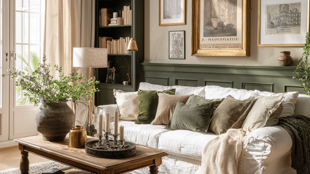
This year’s color trends focus on balance and warmth. Think terracotta and clay tones that add subtle richness, olive and moss greens that connect interiors to nature, and creamy neutrals that soften a space without feeling flat. When layered with texture, natural materials, and thoughtful accents, these palettes create homes that feel both elevated and inviting.
In this guide, you’ll discover the most impactful home decor color trends for 2026, including the earthy neutrals designers are favoring, the accent shades gaining popularity, and practical ways to use these colors throughout your home. Whether you’re planning a full refresh or making small updates, these palettes are designed to work beautifully year-round.
Top Home Decor Color Palettes for 2026
1. Terracotta, Olive, and Cream
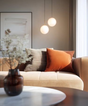
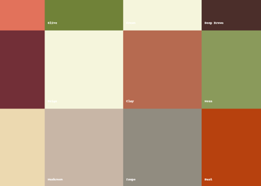
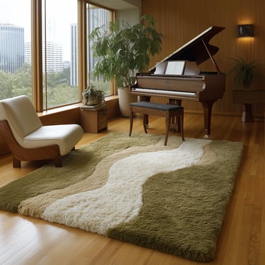
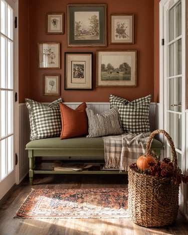
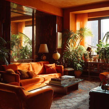
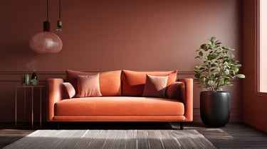
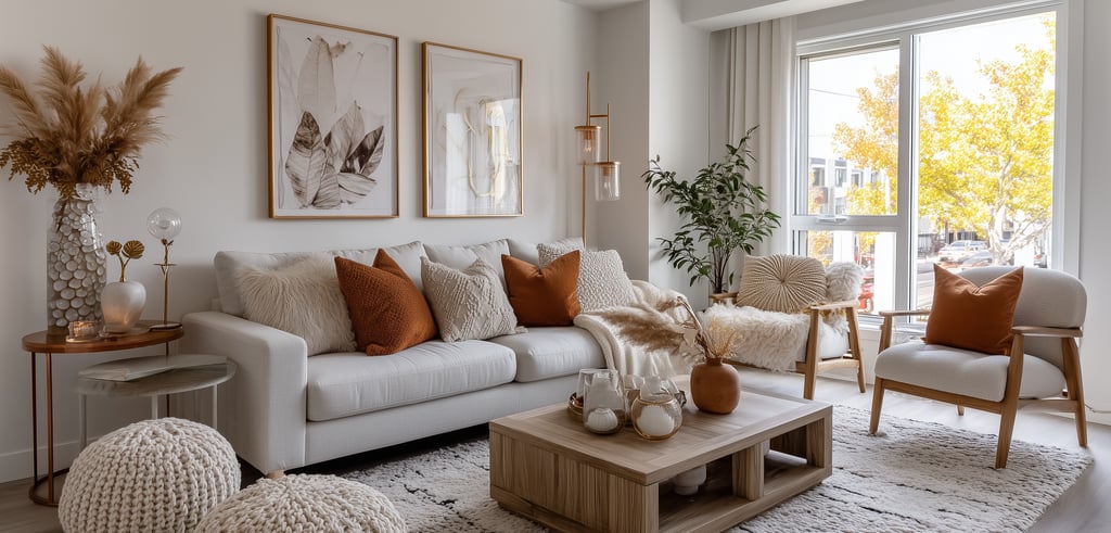
Warm, grounded, and inviting, this palette captures the essence of 2026 interiors. Terracotta brings an earthy richness, olive green adds depth and a connection to nature, and cream softens the look for balance. Together, these tones create spaces that feel cozy yet refined, working beautifully in living rooms and open-plan areas.
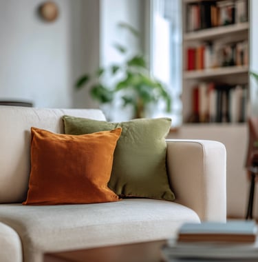
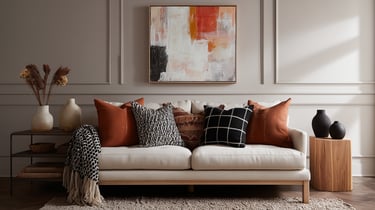
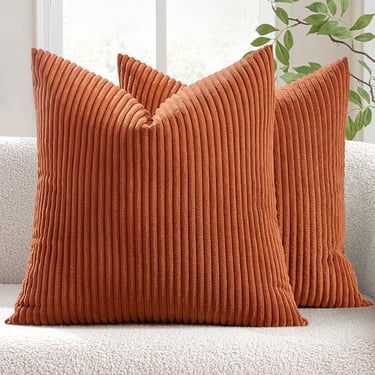
✨ Quick update: Add terracotta throw pillows to a cream sofa and layer an olive knit blanket over the armrest for instant warmth.
💡 Budget vs. splurge ideas:
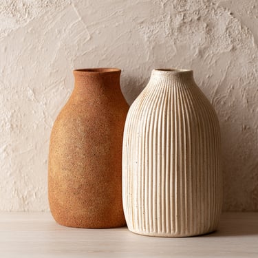
Budget: Terracotta ceramic vases or textured pillow covers, easy finds on Amazon that instantly add warmth.
Splurge: An olive green velvet accent chair to anchor the space with color and texture.
2. Deep Brown, Wine, and Beige
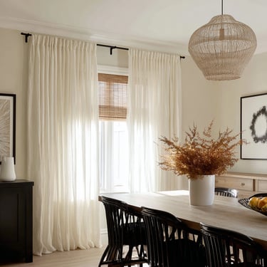
This palette leans elegant and timeless. Deep brown grounds the room, wine tones add richness, and beige keeps everything light and approachable. It’s especially well-suited for dining rooms and cozy living spaces where you want a sense of warmth without heaviness.
✨ Quick update: Swap lightweight beige curtains or cushions for a wine-toned throw or accent pillow to deepen the color story.
💡 Budget vs. splurge ideas:
Budget: Burgundy or wine-toned table linens and decorative accents, widely available on Amazon.
Splurge: A handcrafted walnut coffee table that adds depth and long-term character.
3. Clay, Moss, and Sand
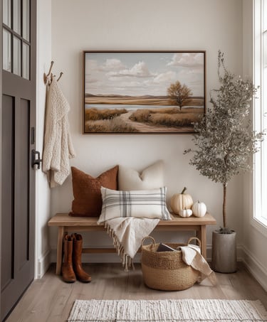
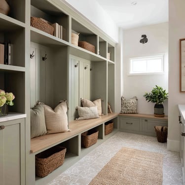
Inspired by nature, this palette feels calm, organic, and effortlessly stylish. Clay tones introduce warmth, moss green adds a soothing element, and sandy neutrals tie everything together. This combination works especially well in entryways, bathrooms, and sunrooms.
✨ Quick update: Style a moss-green runner in the entryway and pair it with a clay-toned umbrella stand or decorative vessel.
💡 Budget vs. splurge ideas:
Budget: Sand-colored pillows, bath accessories, or planters, easy Amazon swaps with a big visual payoff.
Splurge: A clay-toned accent wall using limewash paint for a soft, textured finish.
4. Mushroom, Taupe, and Rust
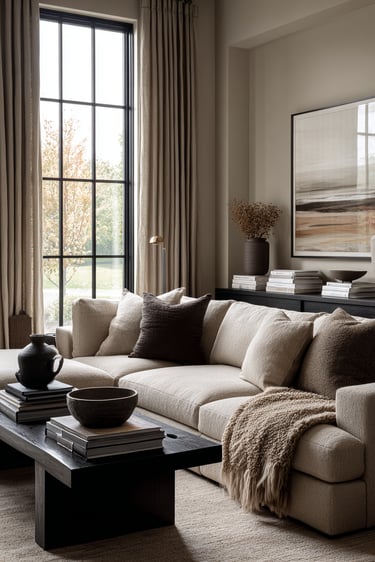
Soft, versatile, and quietly elevated, this palette balances subtle neutrals with a warm accent. Mushroom and taupe create a calm base, while rust adds just enough energy to keep the space from feeling flat. This mix works beautifully in bedrooms and relaxed living areas.
✨ Quick update: Add rust-colored cushions or a throw to a taupe sofa for a warm, modern contrast.
💡 Budget vs. splurge ideas:
Budget: Rust-toned candle holders or decorative trays—small Amazon finds that add warmth instantly.
Splurge: A taupe boucle sofa for texture and long-lasting style.
✨ Pro Tip: Use the 60–30–10 rule for a balanced look—60% base color, 30% secondary tone, and 10% accent. This approach keeps earthy palettes feeling intentional and polished rather than overwhelming.
Trending Accent Colors for 2026 Home Decor
Beyond full color palettes, certain accent colors are standing out in 2026 interiors. These shades are easy to layer into any space and can refresh a room without the commitment of a full makeover. When used intentionally, accent colors add depth, warmth, and personality while keeping the overall look balanced.
Forest Green
Grounded and elegant, forest green continues to be a favorite in 2026, especially in dining rooms and kitchens. It pairs beautifully with warm wood finishes, stone surfaces, and brass or antique gold accents for a timeless feel.
✨ Quick update: Style a forest green table runner with brass candlesticks or wood accessories for an instant upgrade.
💡 Common mistake to avoid: Overusing forest green in small, low-light spaces, which can make a room feel heavy. Balance it with lighter neutrals or reflective finishes.
Amazon-friendly note: Table linens, candle holders, and small decor accents in forest green are easy, affordable swaps to test this color.
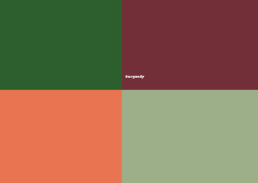
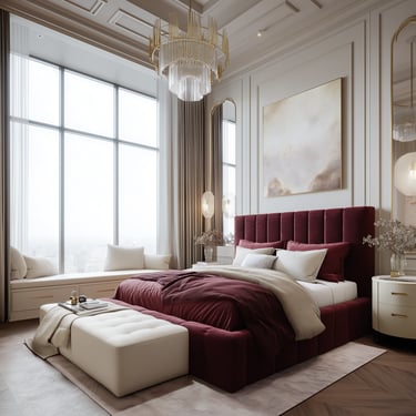
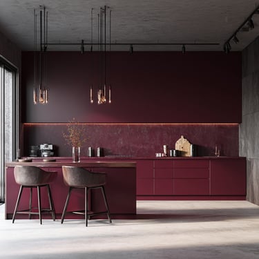
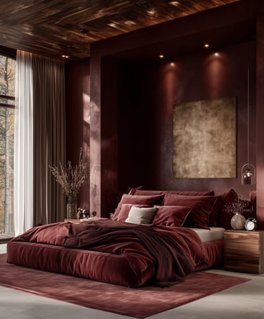
Burgundy
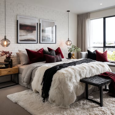
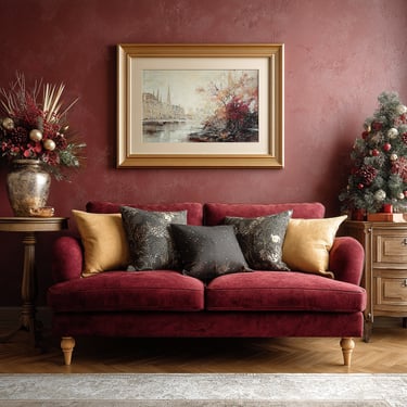
Rich and cozy, burgundy adds depth without overwhelming a space. It works especially well in bedrooms and living rooms, where it creates a sense of warmth and quiet luxury.
✨ Quick update: Drape a burgundy throw blanket at the foot of a cream or beige bedspread.
💡 Common mistake to avoid: Pairing burgundy only with dark tones. Mixing in beige, cream, or soft taupe keeps the look fresh and balanced.
Burnt Sienna
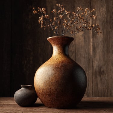
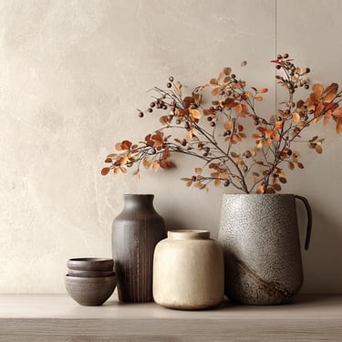
Burnt sienna is a clay-inspired shade that brings warmth and character to interiors. In 2026, it’s most often used in textiles, pottery, and wall art rather than large furniture pieces.
✨ Quick update: Style a small grouping of burnt sienna pottery or ceramic vases on a console or shelf.
💡 Common mistake to avoid: Mixing too many red-based shades in one room, which can feel overpowering. Let burnt sienna stand on its own.
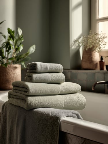
Olive and Sage
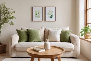
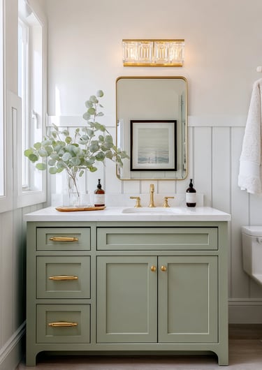
Soft, nature-inspired tones like olive and sage remain popular for their calming effect. These shades work beautifully in entryways, bathrooms, bedrooms, and cozy reading corners.
✨ Quick update: Swap in sage green towels or a small olive-toned accent pillow for a subtle refresh.
💡 Common mistake to avoid: Letting the palette feel flat. Balance these greens with warm wood, woven textures, or metallic accents.
Amazon-friendly note: Towels, pillows, planters, and small accessories are low-risk ways to incorporate olive and sage.
✨ Style Tip: Accent colors work best when used sparingly. Choose one or two shades per room and repeat them through small decor elements to create a cohesive, intentional look.
Decor Trends That Complement 2026’s Warm Color Palettes
Textured Walls and Ceilings
Walls and ceilings are becoming design features in their own right. Limewash finishes, subtle plaster textures, and paneled details add depth and visual interest while enhancing warm, neutral color palettes.
✨ Quick update: Try removable peel-and-stick wall panels or textured wallpaper for a renter-friendly refresh.
💡 Pro tip: Keep texture to one feature wall or ceiling so the space feels balanced and not overly busy.
Curved Furniture and Architectural Details
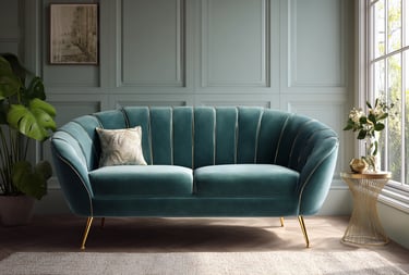
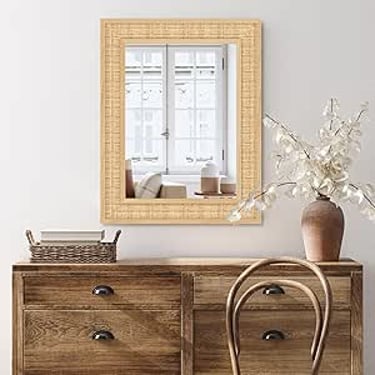
Soft silhouettes continue to shape 2026 interiors. Rounded sofas, curved accent chairs, and arched mirrors naturally complement earthy tones, making rooms feel more welcoming and relaxed.
✨ Quick update: Hang a curved mirror above a console or dresser to soften sharp lines.
💡 Pro tip: Balance curves with clean-lined furniture to keep the look refined rather than themed.
Layered Textiles
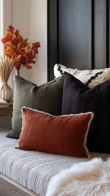
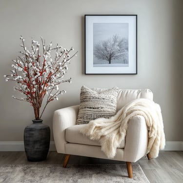
Texture plays a key role in warm interiors. Bouclé, velvet, wool, and knit fabrics add comfort and dimension, especially when layered thoughtfully.
✨ Quick update: Pair a velvet pillow with a bouclé or knit cushion for subtle contrast.
💡 Pro tip: Stick to a cohesive color palette when layering fabrics to avoid visual clutter.
Amazon-friendly note: Pillows, throws, and small textile accents are easy, low-commitment ways to experiment with this trend.
Mixed Metals
Brass, nickel, and aged finishes are increasingly used together in 2026 decor. When repeated intentionally, mixed metals add depth and a touch of sophistication to warm color schemes.
✨ Quick update: Swap cabinet knobs for brass pulls and pair them with a nickel or matte metal lamp.
💡 Pro tip: Repeat each metal finish at least twice in a room so it feels cohesive.
Organic and Natural Elements
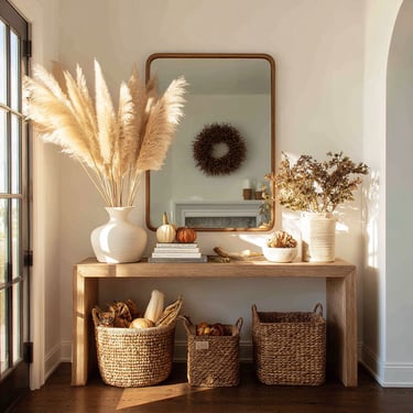
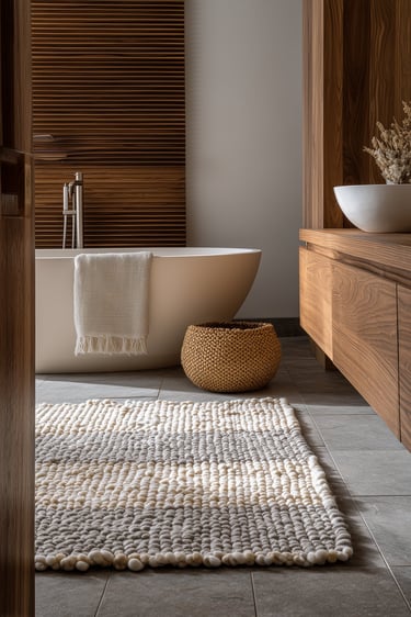
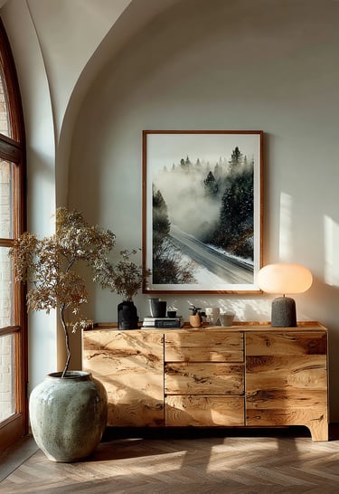
Materials like rattan, cane, wicker, stone, and raw wood continue to complement earthy palettes beautifully. These elements add warmth and texture while reinforcing a connection to nature.
✨ Quick update: Add a rattan basket for throws or a stone decorative object on a shelf or table.
💡 Pro tip: Limit woven elements to one or two key pieces to keep the look elevated rather than overly rustic.
✨ Takeaway: These decor trends don’t require a full redesign. Even a single textured wall, a curved accent, or thoughtfully layered textiles can transform a room when paired with 2026’s warm, earthy color palettes.
Room-by-Room Inspiration
Now that you’ve explored the key color palettes and decor trends, let’s see how they come to life in different rooms. You don’t need a full remodel to embrace 2026’s warm, earthy aesthetic — a few thoughtful updates in each space can completely shift the mood.
Living Room
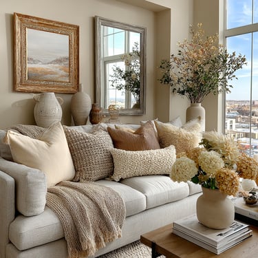
The living room sets the tone for the entire home, making it the perfect place to layer warm neutrals and earthy accents. Focus on comfort, texture, and a cohesive color story.
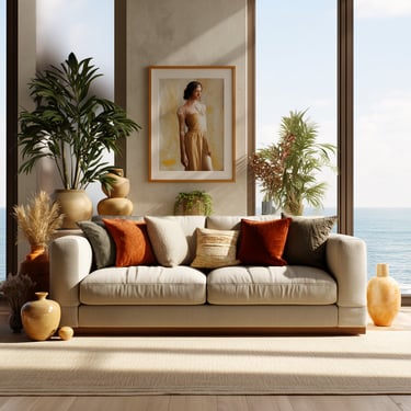
✨ Quick update: Add terracotta throw pillows, an olive knit blanket, and a cream or sand-toned area rug to ground the space.
💡 Budget pick: Rust or terracotta pillow covers and neutral throws — easy, affordable Amazon swaps.
💎 Splurge: A curved velvet sofa in a deep wine or olive shade to anchor the room.
Bedroom
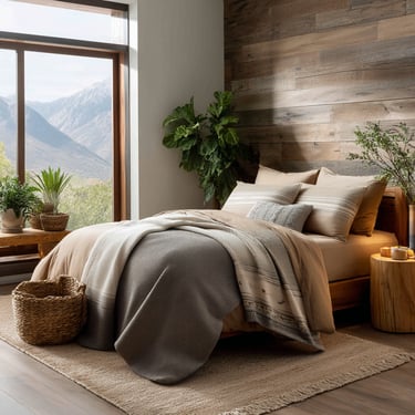
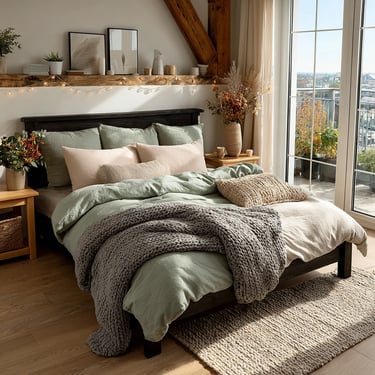
Earthy tones in the bedroom create a calm, inviting retreat. Soft neutrals paired with deeper accents help the space feel cozy without becoming heavy.
✨ Quick update: Layer a burgundy or rust-toned throw at the foot of a cream or taupe duvet.
💡 Budget pick: Sage or olive cotton bedding and pillowcases, widely available on Amazon.
💎 Splurge: A mushroom-colored bouclé headboard for texture and warmth.
Dining Room
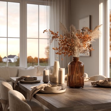
Warm palettes shine in dining spaces, where rich tones and natural materials make gatherings feel more intimate and elevated.
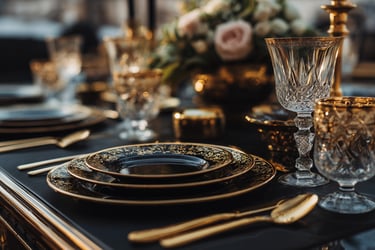
✨ Quick update: Style a deep brown or wine-toned table runner with brass candlesticks or ceramic accents.
💡 Budget pick: Burnt sienna or neutral placemats and table linens.
💎 Splurge: A solid walnut dining table with soft, rounded edges.
Kitchen
In 2026, kitchens are embracing a collected, layered look that mixes old and new. Earthy tones add warmth without sacrificing brightness.
✨ Quick update: Add sage or olive hand towels, clay-toned pottery, or woven barstools for subtle texture.
💡 Budget pick: Terracotta utensil holders, planters, or countertop accessories from Amazon.
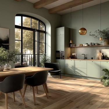
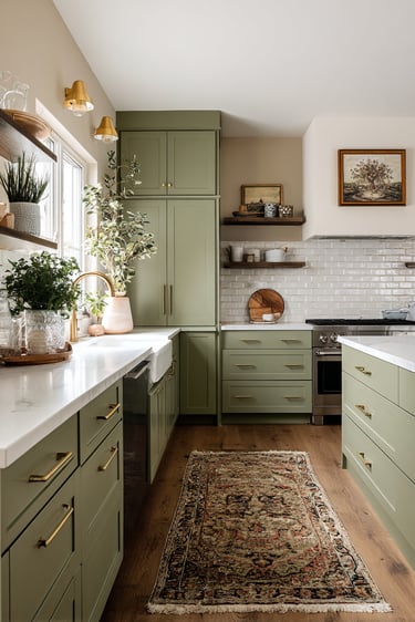
💎 Splurge: Painted cabinetry in deep olive or English green for a bold yet timeless update.
✨ Pro Tip: Choose one main palette and repeat it subtly throughout your home. Carrying a touch of terracotta, olive, or warm beige from room to room creates a cohesive, intentional look without feeling matchy.
Easy & Budget-Friendly Decor Updates
You don’t need a full renovation to refresh your home in 2026. A few thoughtful, budget-friendly updates can completely change the mood of a room while keeping your space warm, cohesive, and timeless. These simple decor swaps deliver noticeable impact with minimal effort.
Textiles That Add Warmth and Depth
Throw pillows, blankets, and rugs are one of the easiest ways to introduce color and texture. In 2026, richer fabrics and earthy tones are key to creating a cozy, lived-in feel.
✨ Quick update: Swap lightweight cottons for velvet, corduroy, or wool in shades like terracotta, burgundy, or olive.
💡 Budget idea: Rust or earth-toned pillow covers and textured throws — easy Amazon finds that instantly refresh a space.
💎 Splurge: A wool or natural-fiber area rug to anchor the room and add warmth underfoot.
Peel-and-Stick Updates with Big Impact
Removable finishes are perfect for renters or anyone who likes to update their home often. Subtle texture and warm neutrals go a long way.
✨ Quick update: Add peel-and-stick wallpaper in mushroom, taupe, or clay tones to a feature wall, or refresh a backsplash with removable tiles.
💡 Budget idea: Peel-and-stick wall panels or backsplash tiles in neutral textures.
💎 Splurge: A limewash or plaster-inspired wall finish for added depth and character.
Candlelight and Ambient Glow
Lighting has an immediate effect on how a space feels. Warm, layered lighting enhances earthy palettes and makes rooms feel more inviting.
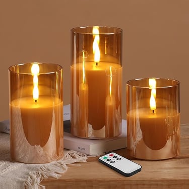
✨ Quick update: Replace bright white bulbs with warm-toned lighting or style flameless candles on shelves and tables.
💡 Budget idea: Glass flameless candles or warm LED bulbs from Amazon.
💎 Splurge: A brass or soft-metal floor lamp with a warm glow.
Art and Wall Accents
Refreshing your walls doesn’t have to be expensive. Art and frames are an easy way to reinforce your color palette.
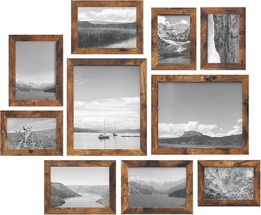
✨ Quick update: Style earthy abstract prints, landscapes, or vintage botanicals in warm frames.
💡 Budget idea: Printable wall art or small framed sets for quick updates.
💎 Splurge: A coordinated gallery wall frame set in wood or antique finishes.
Decorative Accessories
Small accessories bring a space together when styled thoughtfully. Natural materials work especially well with warm palettes.
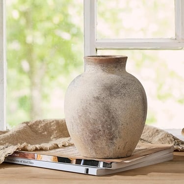
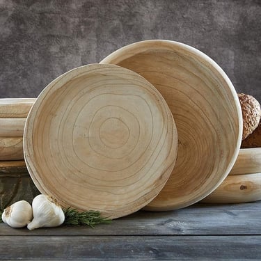
✨ Quick update: Add terracotta vases, natural wood bowls, or rattan accents to shelves and consoles.
💡 Budget idea: Ceramic vases, trays, or decorative objects found easily on Amazon.
💎 Splurge: A statement rattan or woven wall mirror.
✨ Pro Tip: Start with one or two updates per room, a pillow swap, a new lamp, or a decorative vase. These small changes create a noticeable impact without overwhelming your space or your budget.
Common Mistakes to Avoid with Earthy Color Palettes
Earthy tones can make a space feel grounded, warm, and stylish, but without balance, they can quickly overwhelm a room. These are the most common mistakes to watch out for when decorating with warm, natural hues.
Using One Tone Everywhere
Terracotta, burgundy, or olive can look stunning, but when they dominate every wall and piece of furniture, the result can feel heavy and closed in.
✨ Fix: Follow the 60–30–10 rule
60% neutral base (cream, beige, taupe)
30% earthy secondary color
10% accent color for contrast
This keeps the space layered and visually balanced.
Ignoring Undertones
Earth tones shift dramatically depending on lighting. A clay shade with cool undertones may look perfect in-store but turn gray or dull once it’s in your home.
✨ Fix: Always test samples directly on your walls and observe them in morning, afternoon, and evening light before committing.
Forgetting Neutrals
Earthy palettes shine when softened with light neutrals. Without them, a room can feel muddy or visually crowded.
✨ Fix: Anchor every warm palette with at least one soft neutral like cream, warm white, or light taupe to give the eye a place to rest.
Overloading Decorative Accents
Too many themed or overly bold accessories can overpower an otherwise beautiful palette.
✨ Fix: Focus on timeless elements like texture, shape, and material first; then add a few statement accents rather than filling every surface.
💡 Pro Tip: Step back and view the room as a whole. Ask yourself:
Does this feel layered and intentional, or is one color doing too much of the work?
A balanced space always feels more inviting than one that tries too hard.
What’s Next: How Warm Color Trends Continue to Evolve
Earthy color palettes aren’t a passing trend. As interiors continue to shift toward comfort, warmth, and intentional design, these tones naturally evolve rather than disappear. What changes is how they’re layered, accented, and styled.
Deeper, Richer Accent Colors
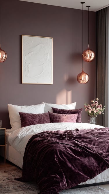
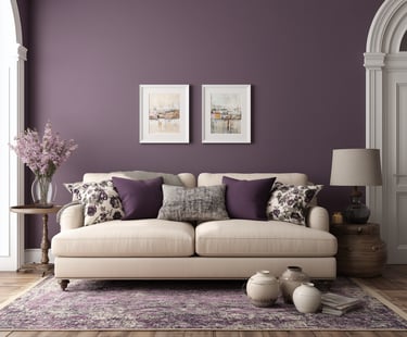
Warm neutrals pair beautifully with deeper shades like plum, emerald, and midnight blue. These colors add contrast and depth while keeping spaces grounded and sophisticated.
Elevated Metallic Touches
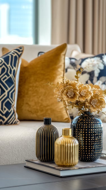
Brass, soft gold, and muted silver continue to play a supporting role. Used in lighting, mirrors, and hardware, metallic accents bring balance and subtle shine to warm palettes.
Layered Texture Over Minimalism
Instead of stark simplicity, homes are embracing texture. Think knits layered with velvet, natural wood mixed with stone, and soft textiles balanced with structured pieces. The result feels inviting, not cluttered.
Easy Styling Transitions
You don’t need to start over to stay current:
Swap accent pillows or throws for deeper tones
Add one metallic or sculptural decor piece
Introduce warm lighting to enhance existing colors
Design Tip: Warm palettes work best when they evolve slowly. Small updates keep your space feeling fresh while maintaining a cohesive, timeless look.
Conclusion
Warm, earthy color palettes continue to shape modern homes because they create spaces that feel grounded, inviting, and full of character. From terracotta and olive to forest green, burgundy, and soft mushroom tones, these hues bring depth and warmth without feeling trendy or temporary. Whether you’re updating a room with textured pillows, experimenting with an accent wall, or layering natural materials, these colors are easy to adapt to any style and any budget.
To make it even easier, I’ve curated a shoppable Amazon list inspired by these color palettes, featuring home decor pieces in terracotta, olive, deep brown, wine, clay, moss, and warm neutrals. It’s a simple way to bring these looks into your home without overthinking every detail.
Now it’s your turn. 💬
Which palette speaks to you most:
Terracotta & Olive, Deep Brown & Wine, Clay & Moss, or Mushroom & Rust?
📌 Save this guide on Pinterest so you can revisit it whenever you’re refreshing your space.
✨ Looking for more home inspiration? Explore my other decor guides, where I share timeless trends, practical styling tips, and curated product finds for real homes.
Your home should feel intentional, comfortable, and lived-in. With the right colors and textures, you can create a space that feels warm, personal, and truly yours, all year round.














Inspiration
Elevate your home with our stylish insights.
Connect
© 2025. All rights reserved.
Disclosure: This website contains affiliate links. If you click on these links and make a purchase, we may earn a small commission at no additional cost to you. These commissions help us maintain and improve our site, ensuring we continue to provide valuable content for our readers.
sales@allpromosolutions.ca
